Showing posts with label Color. Show all posts

Thursday, January 24, 2013

Minimal Color


Styling by Kråkvik & D’Orazio for Jotun (a Norwegian paint company) shows how definition is accomplished by combining minimal shaped forms in a monochromatic color scheme and accented with colors or a change in the surface texture.

Photograph by Siren Lauvdal.

Monday, January 07, 2013

emerald


Celebrating the 2013 Pantone color of the year with some products that boast a modern look.

1 / 2 / 3 / 4 / 5 / 6 / 7

Thursday, October 25, 2012

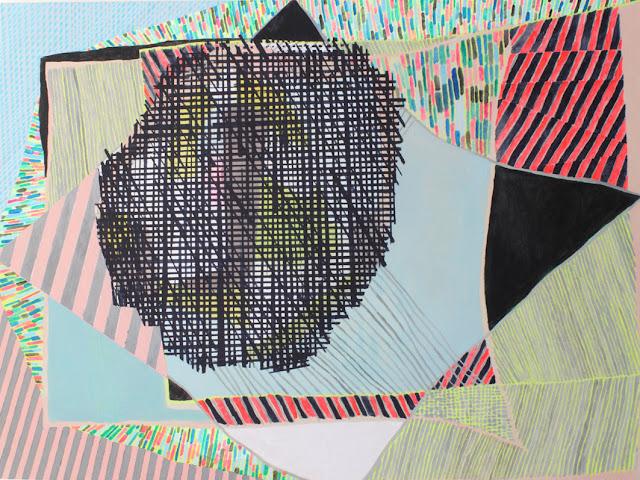
Misato Suzuki


Lovely abstract paintings by Misato Suzuki feature overlaid patterns, shapes, and bright bold colors.

CascadesAllegro

Wednesday, October 03, 2012

Facade


Great facade design by Carlos Arroyo for the Academie MWD Dilbeek.  Each direction you view the facade was designed to compliment the surroundings of the buildings location and to provide a large amount of natural light to the interior space. Here is a great video of a model showing those directions.

Tuesday, September 18, 2012

Color Combo


I'm loving this color combo of Navy mixed with neutrals and pastels, and I'm craving a coffee table like this one since my sofa is a similar shape.

via incorporatedny

Friday, September 14, 2012

Bright Lounge


Love this multi-purpose BU Lounge space at Bangkok University by Supermachine Studio.  Great use of color and form to divide the space and create flexible study and event areas.

Thursday, August 23, 2012

Josef Shulz


Great architectural styled photographs displaying color blocked forms by Josef Shulz.

Wednesday, June 27, 2012

Bright!


Loving bright color schemes right now, don't you love these graphic stripes and angles!

Spektrum Eins - by Matthias Heiderich

Tuesday, February 07, 2012

Pattern


This photo is a great representation of color and pattern repetition.   I love the way the color gradation changes as it goes through the space.


Thursday, October 13, 2011

Get the look.


Take a look at this fabulous Missoni inspired chevron blanket, you can get the pattern here

Image via VickieHowell.

Tuesday, February 08, 2011

Light + Glass = Art


I visited the Boise Art Museum this past week to see the beautiful artwork of Stephen Knapp. Knapp uses a light source along with various glass pieces arranged to create beautiful reflections of light. If you are near Boise its definitely worth seeing... plus visit the website for a list of upcoming exhibits.

Thursday, February 03, 2011

Brand New...


Kelly Wearstler has added a blog to her resume featuring, My Vibe My Life. It will be great to see her amazing work in process.

Image: via Little Collections, A vibe tray for a library in a Manhattan residence.

Friday, June 11, 2010

What Home Means to Me

Today my post is related to Pin it Forward, this event is hosted by sfgirlbybay. And its a great way be exposed to many different bloggers out there. The object this time was to use Pinterest a service which provides you an outlet to share, tag, like, and comment on photos that inspire you in different ways. There are many participants, so each day one blogger from 10 groups will write about a similar theme of Home. Today there is postings by passionista!, flora douville, apple blue, the other tiffany, victoria klein, the gift was ours to borrow, quilts a bit, window ledge arts, and poppytalk. I am so excited to be a part of this group of talented and inspiring people!!


A Place to store my treasures and to display all of the things that I love.


A Place to relax and be creative and dream about the future.


A Place to entertain family and friends and to create new ways of living.

Thanks to Victoria of sfgirlbybay, and Pinterest for this great idea. And also to the reading nest for passing this along. Feel free to check out my pinboard here for more inspiration and the locations of each photo. Please check out happy serendipity who will post on Monday.

Thursday, June 10, 2010

Colorful!!


I needed to post some bright colors today because the weather here has been so gloomy. I found this image on flickr that was originally posted on Apartment Therapy. I really love the tailored look of the couch, bench, chair...along with the bright accent colors and the dark contrast of the bookcase. I like that they used the picture molding as a way to accent some cheerful wallpaper as well.

Check back tomorrow for my Pin it Forward post!!

Wednesday, April 07, 2010

Luis Barragán


Towers of the Ciudad Satélite

Fuente de los Amantes


Luis Barragán House and Studio (Tacubaya, Mexico City)

Luis Barragán House and Studio (Tacubaya, Mexico City)

One of my favorite architects throughout college until now is Luis Barragán (1902-1988), he created minimalist architecture but broke the rules by using vibrant colors to enhance the forms within space. His work is very different from the other architecture in Mexico City, as it creates a mood and statement through bold design.

Tuesday, January 19, 2010

Turquoise


“It is believed to be a protective talisman, a color of deep compassion and healing, and a color of faith and truth, inspired by water and sky. Through years of color word-association studies, we also find that Turquoise represents an escape to many – taking them to a tropical paradise that is pleasant and inviting, even if only a fantasy.”
Leatrice Eiseman, executive director of the Pantone Color Institute®.

The color of the year for 2010 according to Pantone (leaders in color forcasting) is turquoise! Below are some fantastic images using the color as an accent or in a bold but beautiful way.

Monday, November 16, 2009

LinkWithin

Blog Widget by LinkWithin